

Monastiraki
A hospitality website that turns an uneven image archive into a coherent journey through the stay, the city and the booking decision.

Overview
Monastiraki Hotel Apartments is positioned above one of Athens' most vibrant historic areas, where movement, heritage and the rhythm of the city shape the guest experience before they even enter the space. The digital direction focused on creating a counterpoint to that intensity: a sense of calm, privacy and refinement that communicates the apartments as a quiet stay above the city.
The website had to behave like hospitality, not like a brochure. Location, accommodation and booking needed to remain obvious, while restrained typography and controlled pacing gave the experience a quieter rhythm.
The work also included early digital positioning through the proposal of the monastirakihotel.gr domain, a direct and memorable address that clearly connects the property to its location. This naming decision supports discoverability and gives the project a straightforward online identity before the user even reaches the website.
Skills: Hospitality Web Design · WordPress Website Design · Content Structure · Visual Direction · Place-Led Storytelling · Information Architecture · Digital Presentation · Domain Strategy · User Flow Clarity · Art Direction
The Website Strategy
The site had to make three things easy to understand: the stay, its location and the path to booking.
Rather than separate atmosphere from practical information, the structure moves between them. The home page introduces the apartment first, then brings Athens into the story; accommodation pages follow with dimensions, capacity, facilities, policies and a direct booking route.
Photography was the hardest part. The source material shifted noticeably in quality, tone and composition, so the design could not rely on a single visual style. A stable navigation band, restrained typography and deliberate crops give the archive order without making the property feel invented.
From first look.
To informed choice.
These four screens show how the site moves from first impression to context, room detail and destination without letting the booking path disappear.
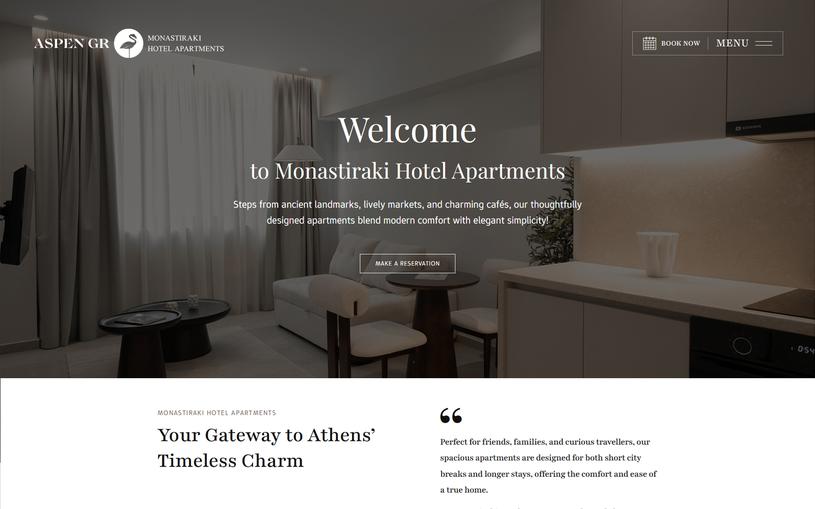
The apartment is visible immediately. Brand, menu and booking share one clear header, while the primary reservation action sits inside the opening frame.
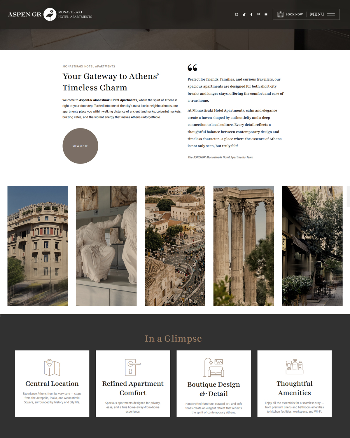
The city image strip establishes the Monastiraki context; the “In a Glimpse” cards translate atmosphere into clear reasons to stay.
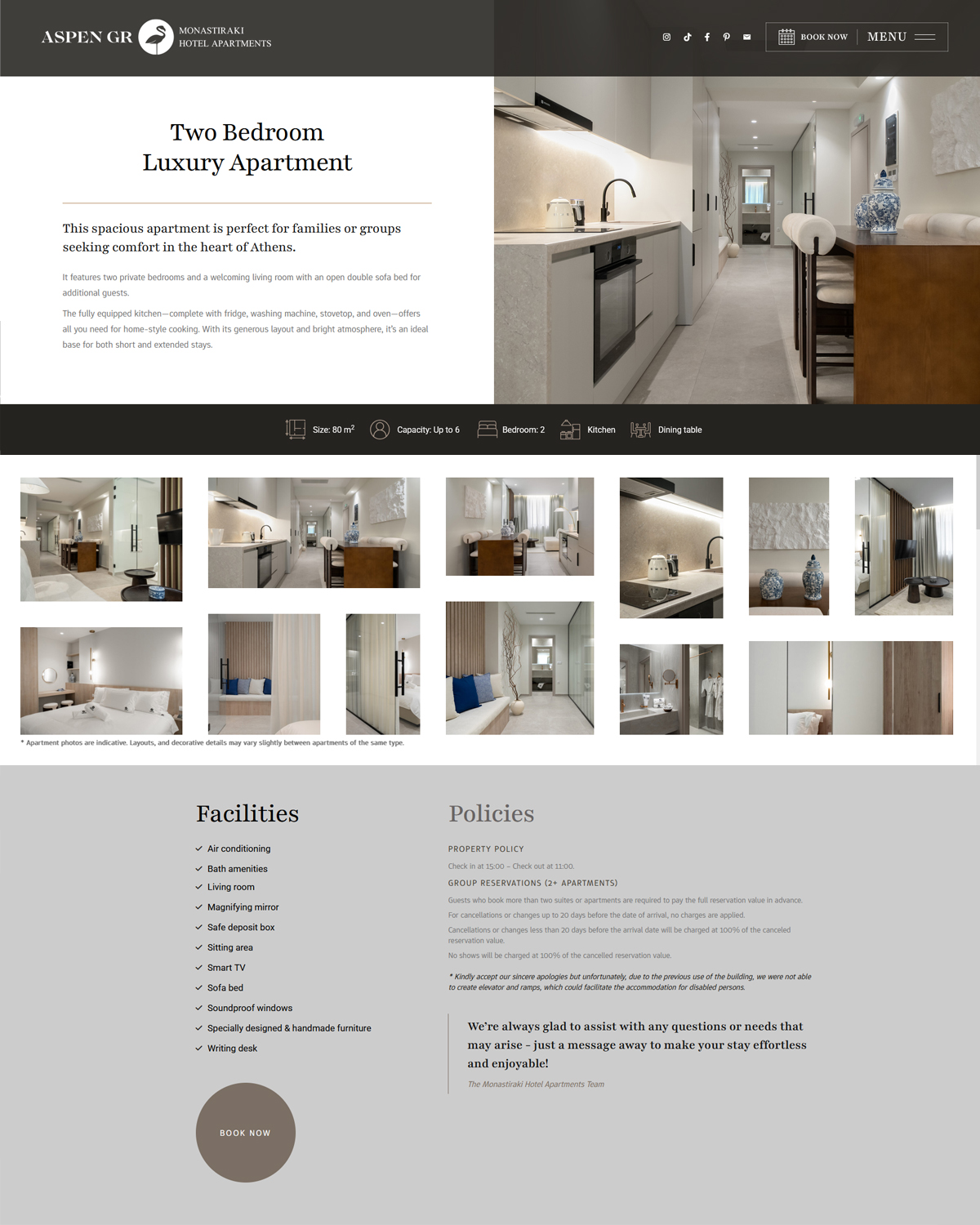
Room type, dimensions, capacity, facilities and policies are resolved on one page. The gallery supports the decision instead of delaying it.
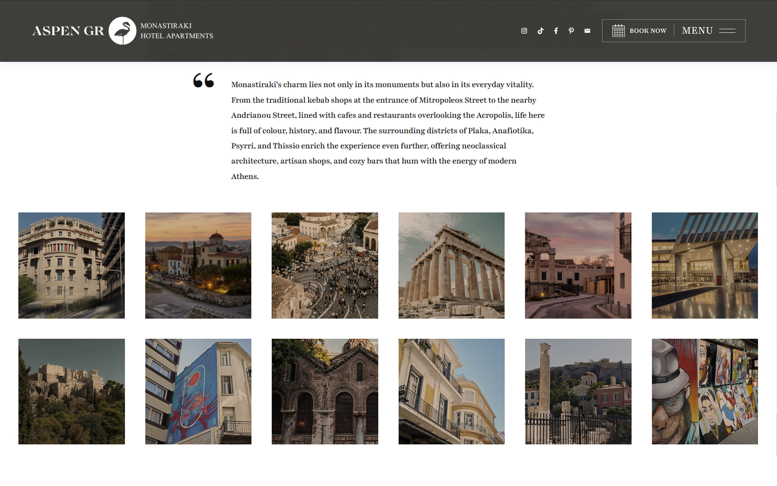
An ordered grid expands the promise beyond the apartment. Consistent crops hold together monuments, streets, architecture and everyday detail.
The System Behind It
Each page alternates between dark anchoring bands and pale content fields. That contrast gives the website a recognisable rhythm while protecting clarity around booking and navigation.
Typography carries the hospitality tone. Serif headlines create presence, sans-serif metadata handles orientation, and the interface avoids decorative controls that would compete with the content.
Photography is assigned by function: room imagery establishes the product; city imagery establishes place; tighter crops connect inconsistent source material. The images do not need to look identical to belong to the same system.
- 01Position
The apartment opens the story; Athens gives it meaning on the next scroll.
- 02Orient
Identity, booking and menu remain grouped in one persistent navigation band.
- 03Frame
Different source images are cropped to stable editorial ratios, preserving focus without forcing false uniformity.
- 04Convert
Booking stays reachable before and after visual exploration.
The website does not pretend the archive is more consistent than it is. It creates continuity around it. Hierarchy, crop and pacing keep the property, the neighbourhood and the booking decision distinct.