
Senior Brand
& Product-Oriented
Digital Designer

CLOSE
Interface Direction & Developer Handoff

Interactive Story Player

Five interface directions for a branching story where the visitor becomes an apprentice of Hippocrates, and the developer handoff for the one that was chosen.

Context
Cultural & Educational Digital Experience
Role
Creative Direction & Interface Direction
Scope
Interface Direction, Responsive Screen Design, AI-assisted Illustration Curation, Developer Handoff
Sector
Culture, Education & Digital Storytelling
The story player interface, an illustration beside the dialogue

Overview

The script runs to 86 screens and it branches. A narrator takes you from the Foundation to the Asclepieion of Kos in the fifth century BC, you choose which apprentice you are, and from there Hippocrates asks the questions.

Two of the three characters are turned back with a reason: a woman could not be a doctor in that century, and a centaur is a myth. Those answers are part of the story, so they could not look like form errors.

The technical framework was already built, so the design had to fit it rather than the other way round. One screen structure had to carry narration, dialogue, a question with three answers, a story the visitor can skip, and a patient to treat, on a 1440 desktop and a 390 phone.

I drew five directions and carried each one across the same six screens, desktop and mobile, so the choice was made on like for like instead of on a single hero screen.

The direction that was approved is the quietest one. The darker directions photograph well and read badly, which is the wrong trade for a text people sit with.

The illustrations are AI-assisted. I curated and corrected them until the set held together: one light, one drawing style, transparent grounds so they sit on any field.

Skills: Interface Direction · Screen Design · Digital Storytelling · AI-assisted Image Curation · Developer Handoff

Five directions

Five ways to draw the same plant, carried across the same six screens and the same words, desktop 1440 × 900 and mobile 390 × 844. The illustration is what separates them; the structure stays put.

Story player direction with a full-colour botanical plate on paper, shown on desktop and phone
01 / Botanical plateThe plant painted in full colour, as in a botanical atlas, on paper.
Story player direction with the plant drawn as a sepia engraving on a terracotta field, on desktop and phone
02 / EngravingThe same plant as an old etching, in one ink on a warm field.
Story player direction with a faded herbarium illustration on a printed texture, on desktop and phone
03 / HerbariumFaded colour on printed texture, the way a pressed plant keeps.
Story player direction with a flat folk ornament on an olive field, shown on desktop and phone
04 / FolkFlat, symmetrical ornament instead of the plate.
Story player direction with the illustration in saturated jewel colour on dark blue, on desktop and phone
05 / SaturatedJewel colour on dark blue, the most contemporary of the five.

The direction that was approved

One illustration, one column of dialogue, and the step dots as the only navigation. Everything else stays out of the reader's way.

The approved story player: the opening screen with the language choice and a fig branch
01 / OpeningGreek or English, before the story starts.
The approved story player: the rod of Asclepius beside the opening lines of the story
02 / First stepThe rod of Asclepius and the opening lines.
The approved story player: a juniper branch beside the dialogue between Hippocrates and the visitor
03 / DialogueHippocrates greets the visitor and asks the first question.
The approved story player: a screen of dialogue text with no illustration
04 / Text aloneA step with no illustration, when the dialogue carries it.
The approved story player: ancient surgical instruments beside their description
05 / InstrumentsSurgical instruments, named in the text beside them.
The approved story player: a poppy illustration beside its plant record
06 / PlantThe poppy, with its record beside it.

The handoff

Eight pages, so that nothing was left to interpretation in code: tokens, the type scale, spacing and grid, components, annotated screens, responsive rules, states and the asset list. Four of them here.
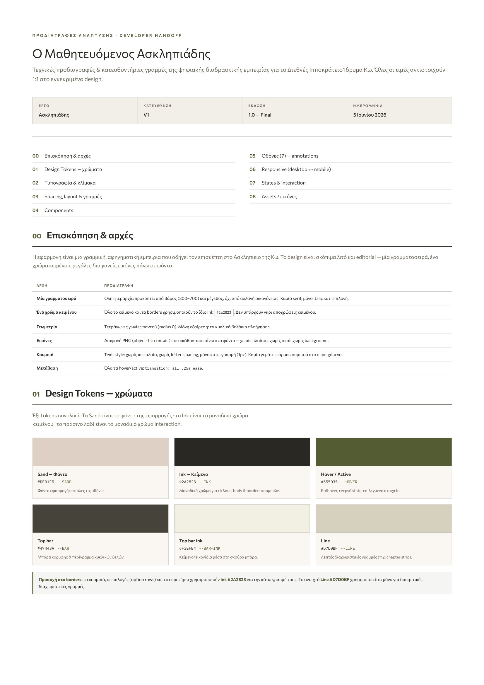
Handoff page with the colour tokens of the interface
01 / TokensColours with their values, and where each one is used.
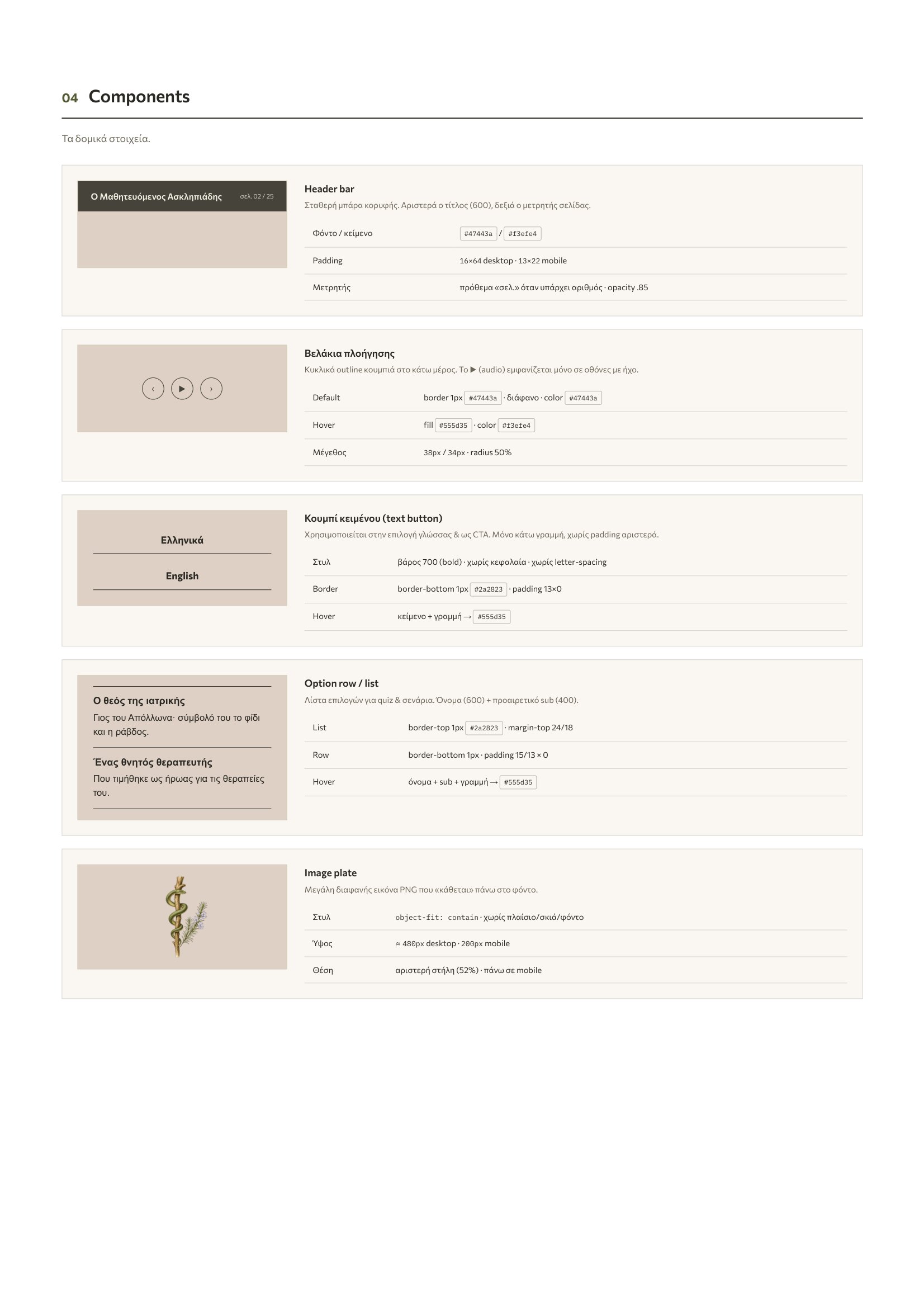
Handoff page with the component specifications
02 / ComponentsEvery component drawn once, with its states written beside it.
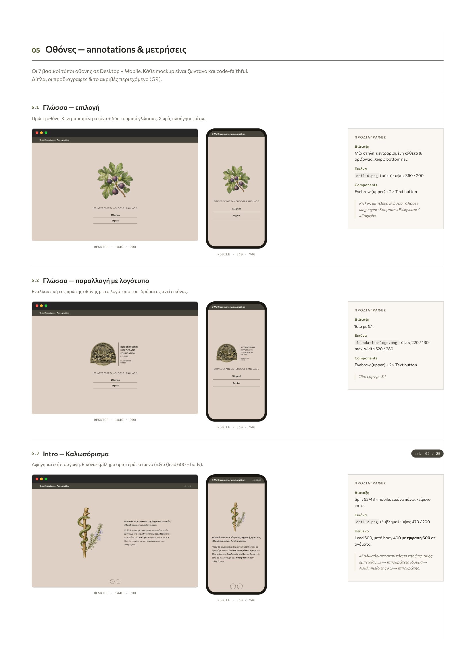
Handoff page with annotated screens and measurements
03 / Annotated screensEach screen measured: spacing, sizes, what moves on a phone.
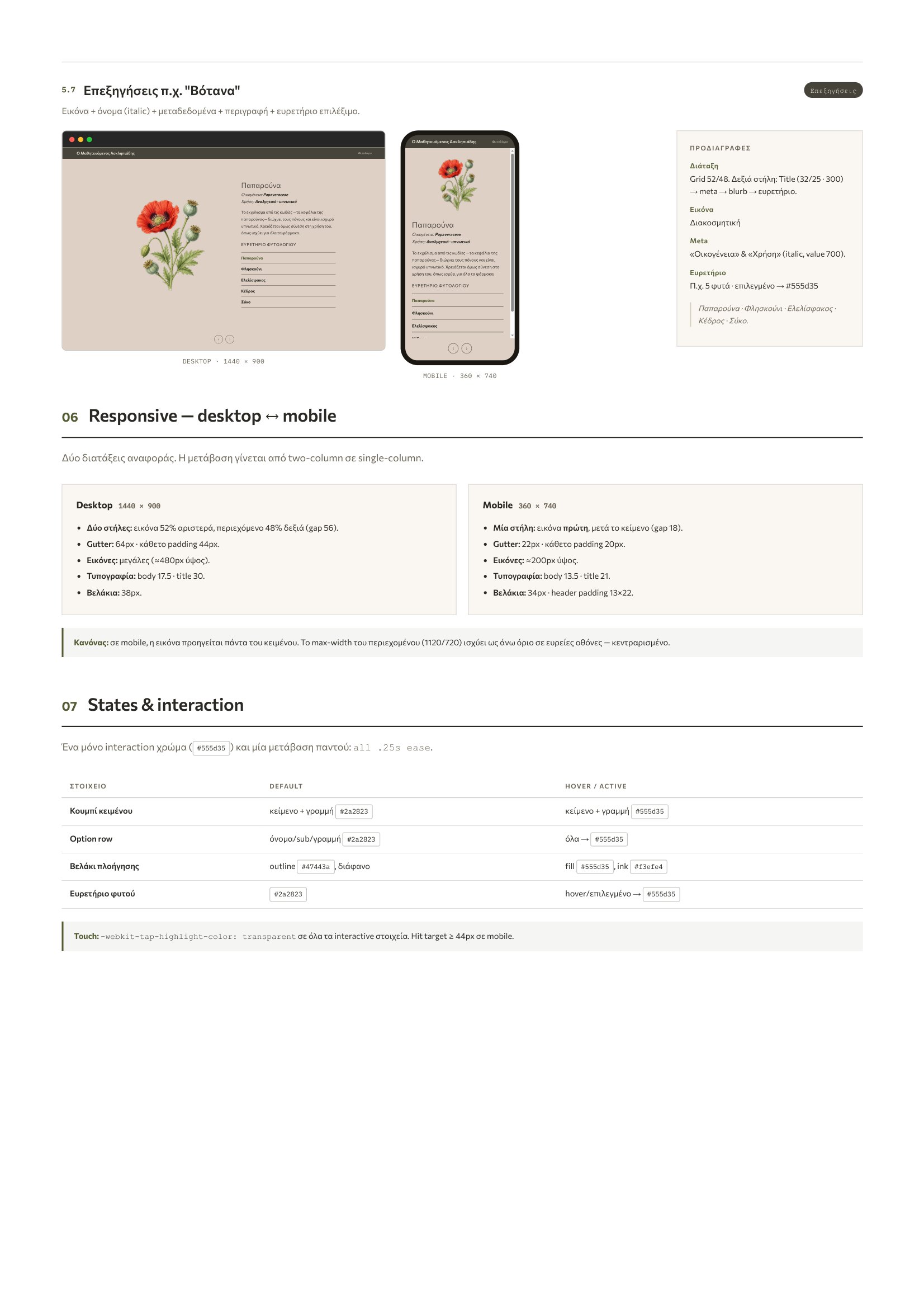
Handoff page with the responsive rules from desktop to phone
04 / ResponsiveDesktop 1440 down to phone 390, and what changes on the way.
The design decision

One screen, many branches. The story turns every second screen: a character, an answer, a tale you can skip. I kept one structure and let the content change inside it, because nobody should have to learn a new layout each time the story turns.

← All projects